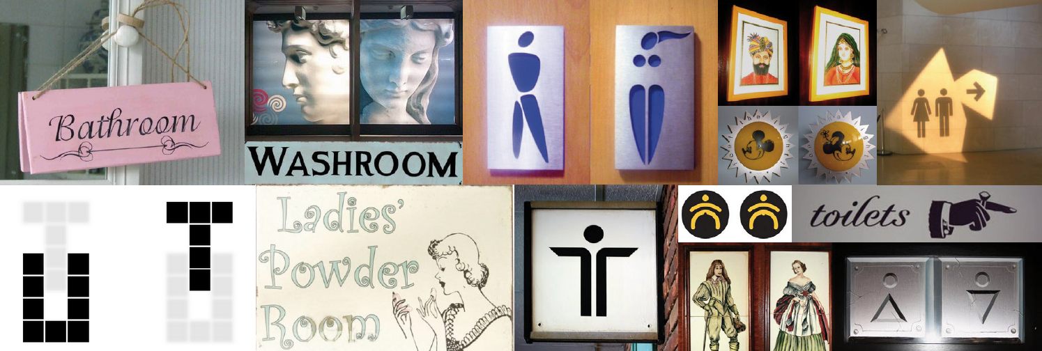
We want to talk to you about going to the toilet
Well, actually we want to talk about more than just going to the toilet, but it’s as good a place as any to start.
We all take signs for granted don’t we? And we’ve all become pretty adept at working out what they mean.
And we all think we can find our way to the toilet, don’t we? But that might not always be the case.
Just think of some of the signs we’ve all come across on our travels and when you couldn’t work out which would be the right door to go through…
There are even websites full of toilet signs like this!
And things change as we get older
Take your dear old gran, slowly succumbing to dementia and retreating into a world where she becomes increasingly lost and bewildered. Even the apparently simple act of finding the toilet in a house where she’s lived for over 20 years can become a problem.
She can became easily disoriented and, having got out of her armchair to go to the loo, may forgot by the time she reached the living room door where she is going, and why.
What makes a good toilet sign?
Take for example the humble toilet sign. Or is it lavatory? Or WC? Or washroom? Or powder room? Or even the humble public convenience?
And what if you are in a foreign country? How easy is it then?
That’s exactly how people with dementia must feel, completely unable to recognise even the simplest word.
Sign designers have tried over the years to come up with universally recognised symbols for toilet. Although sometimes they aren’t always that easy to spot!
But all this is no use to people living with dementia, they simply don’t know what these symbols mean any more.
And if that’s not hard enough…
Signs aren’t always as clearly produced as they might be. The lettering is too complicated or the colours used are too subtle. If we have problems then think how people with failing eyesight (which can accompany dementia) must feel.
The important thing to remember is that as we age and our eyesight goes, the last colour to go is the yellow spectrum, so if we want a sign that really works, it’s important to choose signs with as much contrast and clarity as possible.
http://dementia.stir.ac.uk/design/virtual-environments/importance-colour-and-contrast
It is essential to keep signage simple and not to risk further confusion by using obscure images, for example like the often humorous(!) male or female symbols used for toilets in bars and restaurants.
Research and best practice has proved that a simple clear typeface in black, on a yellow background gives the best results for someone living with dementia.
And instead of using icons or drawings, it’s better to use clear, simple, easily recognisable photographs, shown against a strong coloured background.
Because people with dementia often mix up words and letters, the signs use simple wording in a clear, concise, upper and lower case typeface.
A black border helps to draw further attention to a specialist dementia sign by framing the image and providing further contrast with the surrounding door or wall.
And its not just toilet signs
We may have started off by thinking about toilets and toilet signs, but the principle applies to other signs as well.
Good clear signage in residential care and nursing homes is a benefit to all. It helps residents to function more effectively, promotes independence and ensures inclusive access for everyone, not just those with dementia, but also people with learning disabilities or sight problems.
This in turn means they have a better quality of life and make fewer demands on staff.
We have wide range of eye catching, purpose designed signs with universally recognised images that will help residents to identify all the key areas in the home.
We can even help them to recognise their own bedrooms
Personalised bedroom signs with a name and photo can instil a sense of identity, promote independence and confidence and at the same time reduce the confusion that comes from feeling disoriented.
Wandering is often an issue
People with dementia need as much help as possible to help them navigate their way round – either in nursing homes or more so these days in their own homes.
Directional dementia signage should be located throughout the care home to provide comfort and reassurance to the residents that they are going the right way.
As regards positioning, because people with dementia tend to look downwards, it is advisable to put the signs slightly lower than normal at a height of approx. 1.4m (4’ 6”).
If good signs can trigger the right memories then a trip to the toilet for example is going to be far more successful than perhaps it might be.
But not here!
But remember that dementia signage should only be put in those areas that you want the residents to use, such as toilets, bathrooms, the dining room and lounge.
Dementia signage should not be used for lifts and other areas, such as the kitchen or office, that you don’t want residents to enter, or which it could be dangerous for them to visit without assistance.
Signage for these areas should blend into the background.
https://www.thelancet.com/journals/lancet/article/PIIS0140-6736(17)31813-5/fulltext
It’s a win win situation
By minimising anxiety and confusion, specialist dementia signs make the residents more self-sufficient. They also help to create a warmer, friendlier environment that’s more like a home than a hotel.
Successful dementia signage will also help to make life easier for the carers. Returning to our first example, if residents are able to find their way unaided to the toilet, there will be less cleaning and clothes changing required. Staff will also feel valued by working in an environment which is more supportive of the residents.
The benefits are many and will demonstrate to all your concern for residents, staff and visitors alike.

